Hello, my name is Scott Simpson, AKA Simpy. I work with businesses to solve problems related to
their online presence while reducing costs and increasing revenue.
I believe design should be simple in order to facilitate communication with your customers. My design aesthetic strives to convey information in transparent modes. The design is virtually invisible, resulting in information communicated seamlessly through an effective design.
your business
I help ensure the success of your business. Today's web is being consumed on more types of devices than ever before. This creates some interesting challenges when getting your content out to multiple devices such as phones, tablets, laptops, and desktops. This is where my expertise with responsive design and mobile development can ensure all of your site's users are getting the best possible experience, resulting in the maximum
return on investment.
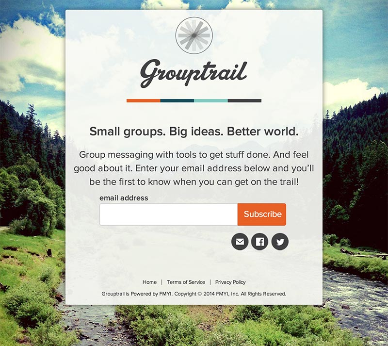
design examples
Here are some examples of my design aesthetic. I created these designs with the focus on clean typography and usability.
Process
My clients are involved throughout the design process. The steps are outlined below:
Discovery
The discovery process is research based. The first step is filling out my client questionnaire. I will review your answers and prepare any questions for the second step which is the discovery meeting. The second step reviewing the client questionnaire. is interviewing stakeholders during a discovery meeting to gain a better understanding of the new websites objectives. During this meeting we gain the understanding on your intent for the new website and how it fits with your overall business strategy.
From this, we can develop a content strategy by first examining your currents site's content. Then either use existing content, edit, or write new content.
Deliverable — A concise creative brief, edited site copy.
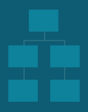
Information architecture
After the content is determined, it will be sorted into the various 'buckets' that will correspond to the site's pages, sub pages, and major sections.
Deliverable — A sitemap flowchart.
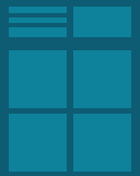
Wireframes
Creating a website is more than just making your text look pretty. The website must be on brand and support user experience best practices. Wireframes begin with pencil and paper (remember those?) and quickly move into clickable prototypes on a web server to which you have access. This way, we can easily have discussions about how the site responds across devices. The purpose of wireframes is not to show visual design (such as colors, type, and branding) but rather how the content lays out across the site.
Deliverable — Clickable wireframes hosted online.
Mood boards
Mood boards can help get the design conversation started. These can be snippets from other websites, posters, or other design pieces. They can help determine a general mood via color and typography
Deliverable — A PDF moodboard illustrating possible look and feel for the website.
Style tiles
Style Tiles are a way to show multiple design directions without the investment of creating multiple mockups. Stile Tiles work in conjunction with wireframes to produce the final site.
Deliverable — A style tile to use for establishing the look and feel of the website.
Visual Design/Front end Development
After style tiles are discussed will generate mockups that will show what a typical page will look like on a desktop, and a mobile view. Once these are reviewed with a client, I will begin to create the pages with HTML and CSS, which the client will have access to along the process. This phase integrates the content, wireframes, and style tiles into a working web page. During this part of the process you will have access to a URL where the design is in progress. We will have regular discussions along the way regarding the design direction and expound further on the previous steps in the process.
With the proliferation of mobile devices has come an increased interest in responsive web design (RWD). RWD takes into account the multitude of devices where your content will be displayed and rearranges the content to show appropriately. This allows devices of varying sizes to display content without excessive pinch and zoom by your site’s users. While this may seem like a panacea, often times a responsive solution is not the best choice.
As my friends, colleagues, and clients are well aware, I am a WordPress guy. Really, I love WordPress. However, sometimes (or often) the advanced functionality that WordPress brings to the table is not needed. Along with its awesomeness, WordPress has a technical debt cost in relation to hosting, security, and environment migration.
The terms responsive web design and adaptive web design are often interchanged. While these two constructs are similar, the differences are important to understand.
I have worked at agencies (engauge, now Moxie), large corporations (AJC.com), as well as startups (Kabbage ).
Running my own design studio allows me to work directly with clients providing them with the most direct route to value.
I also have a formal design background with a degree from PSU. Check me out on LinkedIn,
Twitter, or Instagram
contact
Are you looking to get your next project started? Feel free to get in touch. Either call me at
, send an email to: scott@simply-simpy.com,
or fill out the form below. Thanks!


 With the proliferation of mobile devices has come an increased interest in responsive web design (RWD). RWD takes into account the multitude of devices where your content will be displayed and rearranges the content to show appropriately. This allows devices of varying sizes to display content without excessive pinch and zoom by your site’s users. While this may seem like a panacea, often times a responsive solution is not the best choice.
 As my friends, colleagues, and clients are well aware, I am a WordPress guy. Really, I love WordPress. However, sometimes (or often) the advanced functionality that WordPress brings to the table is not needed. Along with its awesomeness, WordPress has a technical debt cost in relation to hosting, security, and environment migration.
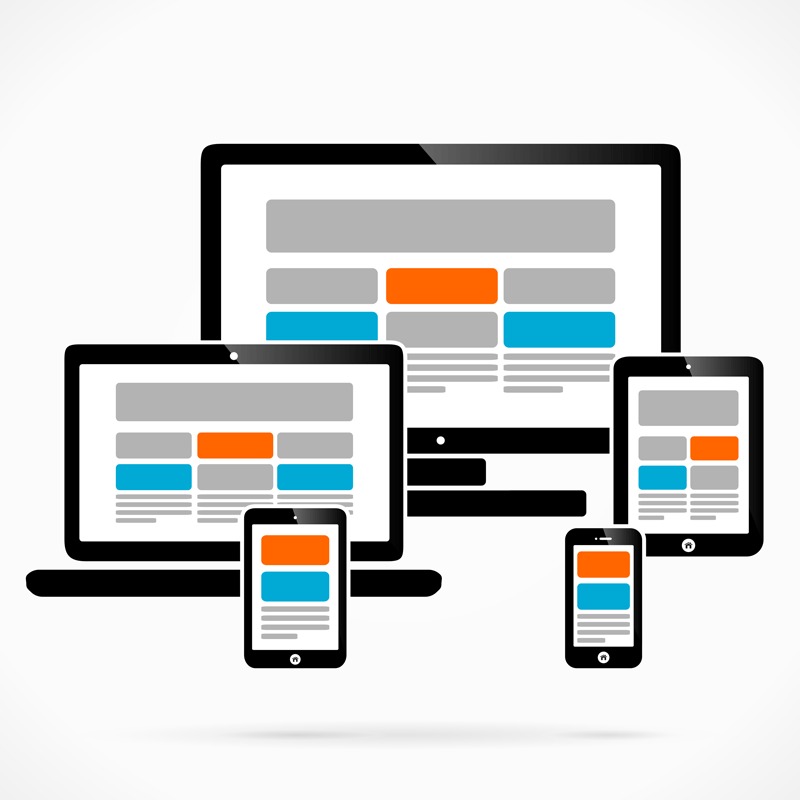 The terms responsive web design and adaptive web design are often interchanged. While these two constructs are similar, the differences are important to understand.